Sass Mixins
If you're a fan of sass and react, I think you'll find this interesting.
Let me introduce two npm packages I've written: @strawburster/switch
and @strawburster/router.
Table of Contents
@strawburster/switch
A switch is a stateful layout container which can manipulate elements using powerful templating syntax and standard css transitions or animations.
State
The state that a switch layout keeps track of is a string. All possible switch states must be specified at compile time in order to build the css.
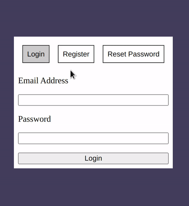
@use 'pkg:@strawburster/switch' as *;

.auth {
    @include switch(auth, 'login', 'register', 'reset-password');
}
In this example, the name of the switch is auth and the state can be
either login, register, or reset-password.
It's important that the switch mixin is wrapped in a css selector,
like above, because it makes use of the parent selector &.
JS Api
The sass mixin must work in tandem with the React hook
useSwitch. That means it must have the same name and possible
states.
import React from 'react';
import useSwitch from '@strawburster/switch';

export defaultFunction Auth() {
  const [authSwitch, setAuth] = useSwitch(
    { name: 'auth' },
    'login',
    'register',
    'reset-password',
  );
}
The useSwitch hook returns a switch and a function to set its current
state. The switch object should be spread over the top-level
element in the switch layout.
<div {...authSwitch} id="auth"></div>
The function returned by useSwitch can be used to change the state
of the switch layout in an onclick handler:
<button onClick={setAuth('reset-password')}>Reset Password</button>
The function accepts a new state string and returns a function which
changes the state to the new state. If using typescript, the function
will only accept valid states specified with useSwitch.
Both the switch object and state-changing function can be renamed to any valid javascript identifier.
PS: Access current state in javascript
The useSwitch hook optionally returns boolean flags for each of the
states specified, in the order they were passed in:
const [
  orderSwitch,
  setOrderState,
  A_LA_CARTE,
  APPETIZERS,
  SPECIALS,
  ENTREES,
] = useSwitch(
  { name: 'order' },
  'a-la-carte',
  'appetizers',
  'specials',
  'entrees',
);
Each of these boolean values (A_LA_CARTE, APPETIZERS, SPECIALS,
and ENTREES) will be true if that possible state is active, false
otherwise.
Template syntax
The main use case for a switch layout is hiding and showing elements
based on the current state. Without custom styling in the switch
mixin, the default behavior is to add the display: none;
pointer-events: none; properties to elements when they don't match
the current state.
Setting up the template for elements to match the current state can be
done in four ways: direct, exclusion, partial, and partial
exclusion. The template uses the attribute data-[name] where
[name] is the name of the switch layout. So for the above example,
with a name of order, the mixin will look for data-order
attributes in the template in order to check whether to display or
hide each element.
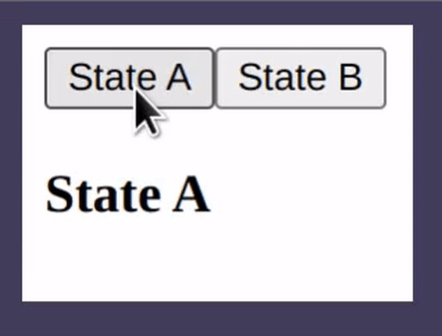
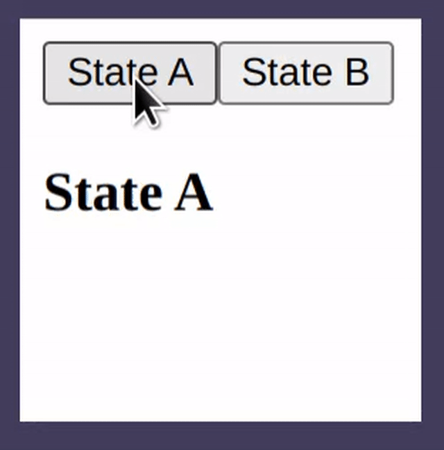
Direct specification
One or more possible states can be listed in the template without any decoration. If the current state matches one of the listed states, the element will be shown. Otherwise, it will be hidden.
<button onClick={setDemoState('state-a')}>State A</button>
<button onClick={setDemoState('state-b')}>State B</button>
<h3 data-demo="state-a">State A</h3>
In this example, with a switch layout named demo, this heading will
only be shown if the current state is state-a.
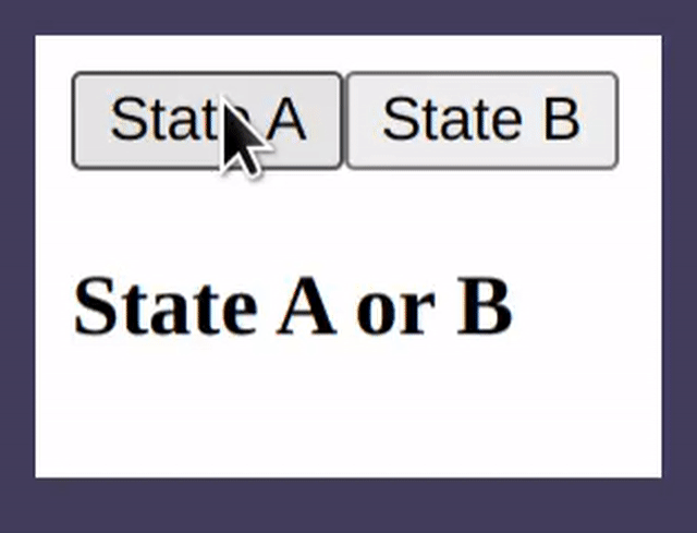
Exclusionary specification
Elements can specify states for which they don't want to be shown by
using the ! operator in the template.
<button onClick={setDemoState('state-a')}>State A</button>
<button onClick={setDemoState('state-b')}>State B</button>
<h3 data-demo="!state-a" >Not state A</h3>
The header here will only be shown on state-b with the exclusionary
syntax.
Exclusion and direct specification cannot be mixed. If any state is
specified with a !, the direct specifications for that element will
be ignored.
Partial/Partial exclusionary specification
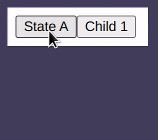
A switch can use forward slashes to denote that a state is a child of another state:
.demo { @include switch.switch( demo, 'state-a', 'parent', 'parent/child-1', 'parent/child-2' ); }
All four of these possible states can be used directly or by
exclusion, as above, but the neat thing about children states is that
they can also be matched using the partial syntax ^.
<button onClick={setDemoState('state-a')}>State A</button>
<button onClick={setDemoState('parent/child-1')}>Child 1</button>
<h3 data-demo="^parent" >Starts with 'parent'</h3>
This header will be shown for all states that start with 'parent'
including 'parent/child-1' and 'parent/child-2'.
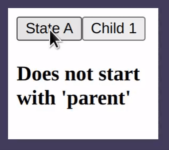
The partial syntax can be combined with the exclusionary syntax to exclude elements when the state starts with the given string.
<button onClick={setDemoState('state-a')}>State A</button>
<button onClick={setDemoState('parent/child-1')}>Child 1</button>
<h3 data-demo="!^parent" >Does not start with 'parent'</h3>
This div will be shown for all states that don't start with
'parent'.
Customize styles
Although the default behavior is to add the display: none;
pointer-events: none; properties to any element who's template does
not match the current state, that can be overriden in order to
provide transitions or animations when the state changes. This can be
done by passing in styles to the switch mixin:
.demo { [data-demo] { transition: opacity 1s; } @include switch(demo, 'state-a', 'state-b') { /** * These styles are applied when the current state *does not* * match an element's data-demo attribute. **/ opacity: 0; } }
In this example, an opacity transition is applied to all elements
which have a data-demo attribute and, when an element's data-demo
attribute does not match the current state, it will have an opacity
of 0.
You can also specify animations to use by specifying a 'default'
animation for all elements, then specifying a 'hiding' animation with
the switch mixin.
.demo { [data-demo] { animation: _fade-in 1s; } @include switch(demo, 'state-a', 'state-b') { animation: _fade-out 1s forwards; } } @keyframes _fade-in { from { opacity: 0; } to { opacity: 1; } } @keyframes _fade-out { to { opacity: 0; } }
Switch child
A specific state can be styled differently from the others using the
switchChild mixin:
.demo { @include switch(demo, 'state-a', 'state-b'); } [data-demo] { @include switchChild(demo, 'state-b') { /** * These styles are applied when the 'demo' switch is * in 'state-b'. **/ border: 1px solid red; } }
Any number of possible states can be specified. In this example, any
data-demo element which is active when the switch is in 'state-b'
will have a red border.
- PS: The switch child mixin can create a heirarchy of switches
Another way to handle heirarchies besides using the forward-slash to denote parent-children relationships is to have multiple switches:
#order { @include switch(order, 'appetizers', 'entrees'); } .entrees { @include switchChild(order, 'entrees') { /** * When the 'entrees' state is active, create a new switch **/ @include switch(entrees, 'pasta', 'pizza'); } }
<div {...orderSwitch} id="order"> <div {...entreesSwitch} data-order="entrees" className="entrees"> <h3 data-entrees="pasta">Pasta</h3> <h3 data-entrees="pizza">Pizza</h3> </div> </div>
@strawburster/router
The router package is an extension of the switch package which works page-wide and updates the url bar using the 'history' api.
The router object
As opposed to the switch layout, the router can specify possible states for both the JS api and the sass mixin simoultaneously. It does this using a JSON object or a serializable JS object.
The router object has three properties: baseUrl, fallback, and
pages.
{
"baseUrl": "/my-site",
"fallback": "/404",
"pages": [
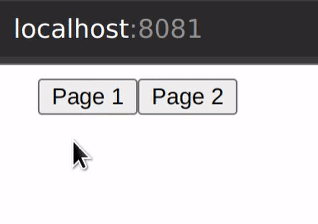
"/",
"/page-1",
"/page-2"
]
}
The baseUrl can tell the javascript api how to change the url bar
when the route changes. If the site is hosted at domain.com/my-site,
the /my-site should be used as the baseUrl. This defaults to /
if ommitted.
A fallback page can be specified which tells the router to display a
certain page if the one requested does not exist. This page may or may
not exist in the pages array.
pages is a list of either strings or Page objects. Usually, you'll
want to specify at least a home page /. Page objects have a path
property and either a redirectTo or children property.
"pages": [ "/", { path: "/page-1", children: { "/child-page-1", "/child-page-2" } }, { path: "/page-2", redirectTo: "/page-1/child-page-2" } ]
This object must be imported into sass and passed as an argument to
the router mixin. One way to do that is with webpack and
@strawburster/sass-json-loader (which I wrote) which uses
json2scss-map (which was written by AS Devs) to automatically
recognize .json and .js imports within sass files:
// webpack.config.js module.exports = { ... module: { rules: [ { test: /\.s?[ac]ss$/i, use: [ 'style-loader', 'css-loader', 'sass-loader', '@strawburster/sass-json-laoder', ], }, ], }, };
Now, @use 'router.json' will use the json2scss-map package to
create a sass map variable named $router.
Sass mixin
@use 'pkg:@strawburster/router' as *; @use 'router.json'; .router { @include router($router); }
The sass mixin takes a router config object and, by default, applies
display: none; pointer-events: none; to elements in the template
which do not match the current route.
If not using webpack, the router can be specified as a sass map so long as it matches with the object used in the javascript api.
JS Api
import React from 'react';
import useRouter from '@strawburster/router';
import routerConfig from './router.json';

export default function App() {
  const [router, goto, currentRoute] = useRouter(routerConfig);
  return (
    <div className="router" {...router}></div>
  )
}
The useRouter react hook takes a router object and returns a router,
a route-changing function, and the current route as a string.
The router object should be spread over the top-level element in the
router in order to give css access to the current route stored in
javascript, like above. The same top-level element should be
selectable in the sass, so I will add a className attribute as well.
The route-changing function returned by useRouter can be used to
change the current route in an onclick handler:
<button onClick={goto('/new-page')}>Go to new page</button>
All items returned by the useRouter hook can renamed to any valid
javascript identifier.
Template syntax
The template syntax for elements closely resembles the syntax for the switch layout. Each element can be hidden or shown using the absolute, exclusionary, relative, relative exclusionary, partial, partial exclusionary, partial relative, or partial relative exclusionary syntax.
| syntax | usage | description |
| absolute | /route |
Shown when current route matches any route specified |
| exclusionary | !/route |
Shown by default, hidden when current route matches any route specified |
| partial | ^/route |
Shown when current route is either /route or any of its children |
| partial exclusion | !^/route |
Shown by default, hidden when current route is either /route or any of its children |
| relative | route (no forward slash) |
Same as absolute, but prepend nearest parent data-route attribute |
| relative exclusion | !route |
Same as relative, but show element by default and hide it if the derived route matches the current route |
| partial relative | ^route |
Same as partial, but prepend nearest parent data-route attribute |
| partial relative exclusion | !^route |
Same as partial exclusion, but prepend nearest parent data-route attribute |
Absolute specification
One or more possible routes can be listed in the template without any decoration. If the current route matches one of those listed, the element will be shown. Otherwise, it will be hidden.
<button onClick={goto('/page-1')}>Page 1</button>
<button onClick={goto('/page-2')}>Page 2</button>
<h3 data-route="/page-1">Page 1</h3>
<h3 data-route="/page-2">Page 2</h3>
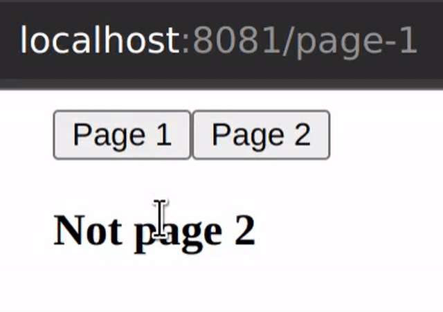
Exclusionary specificaation
Elements can specify routes for which they don't want to be
shown by using the ! operator in the template.
<h3 data-route="!/page-1">Not page 1</h3>
<h3 data-route="!/page-2">Not page 2</h3>
Exclusionary and absolute specification of routes cannot be
mixed. If any state is specified with a !, any absolute routes
specified for that element will be ignored.
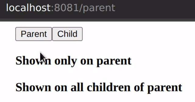
Partial/Partial exclusionary specification
Matching a route that has children can be done using the ^
syntax:
{
  "pages": [
    "/",
    {
      "path": "/parent",
      "children": [
        "/child"
      ]
    }
  ]
}
<h3 data-route="/parent">Shown only on parent</h3>
<h3 data-route="^/parent">Shown on all children of parent</h3>
The partial syntax can be combined with the exclusionary syntax to exclude elements when the current route starts with the given string.
<div data-route="!^/specials"></div>
In this example, the div will be shown for all routes that don't
start with /specials.
Relative, relative exclusion, partial relative and partial relative exclusion
If using the partial syntax to display an element on all children
routes of a given route, children elements can piggy-back off of
the parent data-route attribute by dropping the leading forward
slash. This prevents you from having to specify a long route:
<div data-route="^/some/long/route">
  <span data-route="child1">Child 1</span>
  <span data-route="/some/long/route/child1">
    Equivalent, but more verbose
  </span>
</div>
The top-level element in this pattern must always use an absolute partial specification.
The relative syntax behaves like an absolute specification by default, but can be combined with any other syntax:
<div data-route="^/parent">
  <span data-route="^child">
    Display when route begins with /parent/child
  </span>
  <span data-route="!other-child">
    Display when route begins with /parent but does not equal /parent/other-child
  </span>
  <span data-route="!^child">
    Display when route begins with /parent but does not begin with /parent/child
  </span>
</div>
Customize styles
The default behavior is to add the styles display: none;
pointer-events: none; to elements who's data-route attribute does
not match the current route. That can be overridden in order to
provide route transitions by passing styles to the router mixin:
.router {
  [data-route] {
    /**
     * These styles are applied all the time regardless of the
     * current route.
     **/
    transition: width 1s;
    overflow: hidden;
    white-space: nowrap;
    width: 50px;
  }

  @include router($router) {
    /**
     * These styles are applied when the current route *DOES NOT*
     * match the data-route attribute.
     **/
    width: 0;
  }
}
In this example, a width transition is applied to all elements which
have a data-route attribute, and, when an element's data-route
attribute does not match the current route, it will have a width of 0.
You can also specify animations to use by specifying a 'default'
animation for all data-route elements, then specifying a 'hiding'
animation within the router minix.
.router {
  [data-route] {
    animation: _expand 1s;
    overflow: hidden;
    white-space: nowrap;
  }

  @include router($router) {
    animation: _shrink 1s forwards;
  }
}

@keyframes _expand {
  from {
    width: 0;
  }
  to {
    width: 50px;
  }
}

@keyframes _shrink {
  to {
    width: 0;
  }
}
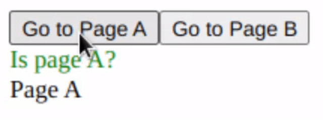
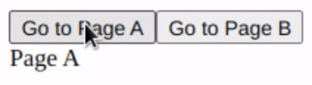
Route child
A specific state can be styled differently from others using the
routeChild mixin:
.router {
  @include router($router);
}

.page-a-indicator {
  color: red;
  @include routeChild('/a') {
    color: green;
  }
}
<span className="page-a-indicator">Is page A?</span>
<span data-route="/a">Page A</span>
<span data-route="/b">Page B</span>